Navigation
The Main navigation may contain some or all of the above:
- Links to Main Pages
- Action Buttons
- Search Button
- Cart
- Language Switcher
Navigation bar
> navigation bar element
> navigation bar
- The Navigation Bar is separated into 3 sections:
- Logo
- Main Menu
- Action Buttons
- Depending on the content of the navigation (buttons, cart etc) and the length of the text you may use up to 6 links in the Main Menu. (Suggested: Our Tests, Locations, Blog, For Doctors, About Us, Contact)
- Always leave some white space to account for smaller screens as the layout might break otherwise.
- The navigation bar should feel easy and intuitive to use. Use short and clear text for the links and actions.
- Do not overwhelm the users with too many options as they might avoid interacting with the navigation.
- The colour for all text and elements in the menu should be Blue-700.
> navigation bar (More LINKS)
When having a larger number of links, you may join the Main Menu with the Action Buttons and consider having a separate sticky button for the cart (or other actions) instead.
> sticky menu (when page is scrolled)
Once the user scrolls past the menu, it should become sticky with a gradient blue background
> search bar
Clicking on the menu magnifying glass icon opens a search bar
> Simple dropdown submenu
The simple dropdown is used to display a small number of child pages and when no subcategories are needed. You can further divide the links into columns to avoid long and narrow lists but avoid having less than 5 links in each column. Always aim to have the space below the logo empty when the simple dropdown menu is open and open the submenu below its parent element
> megamenu
The megamenu should be used when having a larger number of subpages. The subpages can be further divided into categories within the menu.
> Menu tablet design
- No menu items are displayed unless the menu is open
- Clicking on the burger icon opens a dropdown with an accordion-style menu.
- The language switcher is moved to the bottom of the screen, along with a search bar.
- Menu items have a font size of 19px and 36px of space between them.
> Menu tablet design
- When the menu is closed only the cart icon is displayed.
- Clicking on the burger icon opens a dropdown with an drilldown-style menu.
- The current selection stays highlighted at the top with a back button, and any subpages are displayed below.
- Third-level pages are displayed as normal text (large paragraph size).
- The language switcher is moved to the bottom of the screen, along with the buttons and a searchbar.
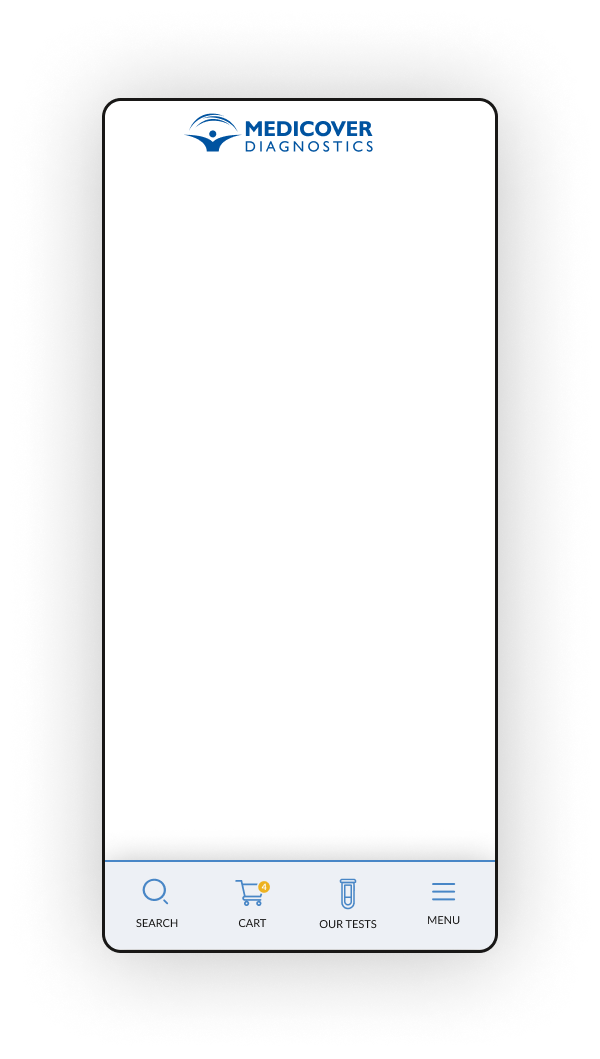
> bottom mobile navigation bar
A bottom navigation bar was created to be used as an alternative for mobile devices, as it is closer to the style of mobile-app navigations. You may use that instead of the top navigation bar and have only the logo in the top bar. Do not make the top bar sticky when using the bottom mobile navigation.
Pagination
Three pagination methods may be used depending on the needs for each occasion:
- Numbered Pages Navigation
- Load More
- Infinite Scroll
> Numbered pages navigation
This method is used when expecting a large number of results. It can give the user more context of the size and current position.
> Load More
This method uses a single page for all content but can’t handle very lage numbers of results as this would increase load times and burden the browser.
Contrary to the Infinite scroll method it requires a click from the user to load more results.
> Infinite Scroll
This method also uses a single page for all content, but keeps loading more content when the user reaches the end of the page.
Similarly to the Load More method, it can not handle a large number of results and if repeated multiple times it might cause fatigue to the user as the number of the results are not clear.
Other navigation elements
> Tags
Tags may be used to categorise content and make it easy for the user to access other relevant content. They may be used in blog articles or product pages.