Elements Guide
Best Practices: Newsletter
> Newsletter Basics
- Follow the brand guidelines designing a newsletter - brand colours and fonts, logo-usage rules and photography guidelines stated in this document.
- Make sure the newsletter adapts well on mobile and the layout does not break on different email clients.
- Make sure that all links and CTAs work and point to the right place.
- Always give the user a way to unsubscribe from the newsletter.
> Newsletter template guidelines
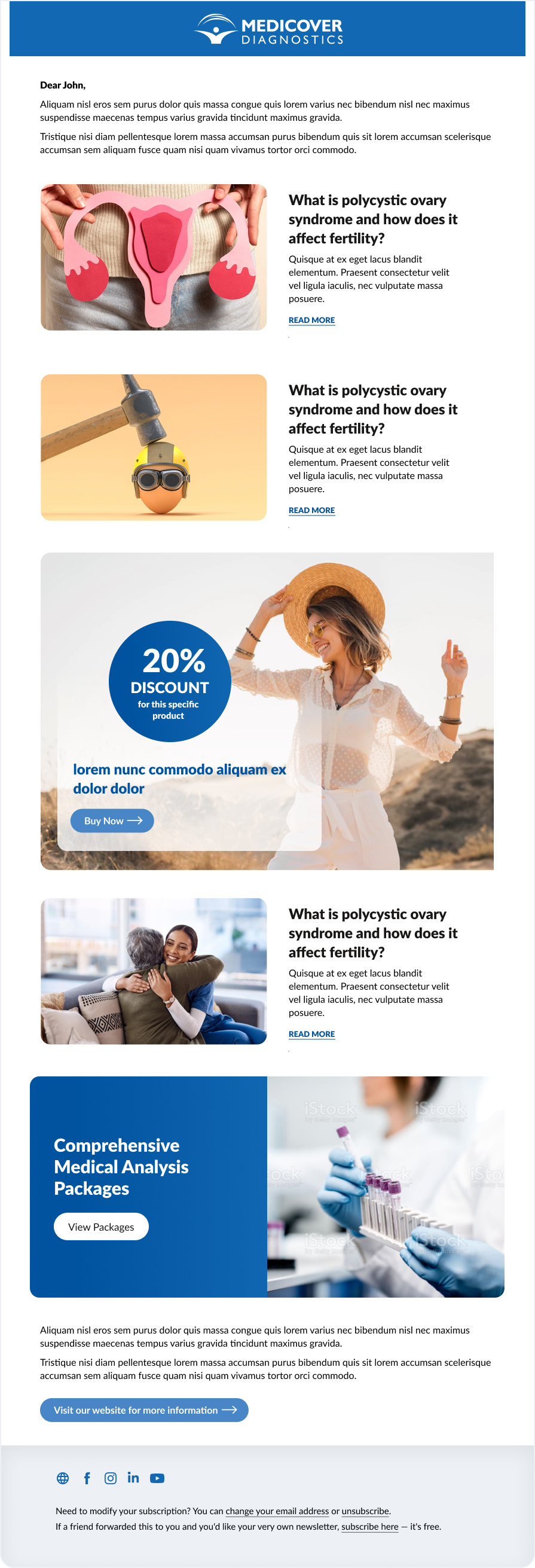
- Reduce overall clutter and distractions. Only include what is necessary in the newsletter and make sure to leave enough white space so that the newsletter does not feel crowded.
- Provide useful content and avoid repetitions in order to keep the readers engaged.
- Use engaging content such as videos, GIF animations or infographics. Make sure to embed any videos or animated GIFs used.
- Create visual hierarchy to guide the reader through the most important parts of the newsletter first. You can achieve that by using different sizes of text, taking advantage of white space and element sizing. Read more about visual hierarchy here.
- Frame the content with a header and footer. This will add an element the users will get familiar with over time and will be able to use to navigate to more content.
- Create a compelling call to action in the end of your newsletter to guide the reader to more information or the online shop.
> Newsletter sample

