Images and icons
> Images Guide
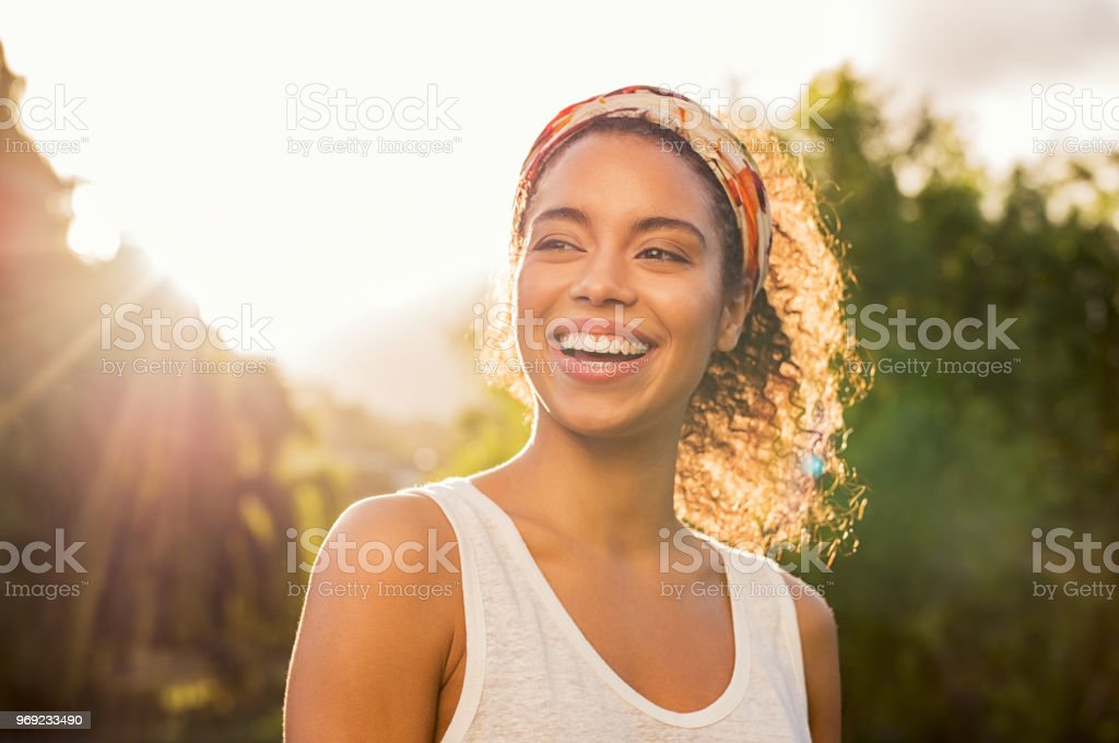
Quality
All photos used on the website should have high resolution, no noise and be in focus.
Colour Balance and Mood
The colours of the image should be well balanced and the images should not be over processed. Use images with bright colours that promote a positive feeling.
No Clutter
The photos should not be cluttered or have too much information; the focus point/subject should be immediately recognisable.
Framing and Composition
Attention should be paid to the framing of the photo. There should be enough white space around the main focus point/subject. (e.g. a face or an object should not be too close to the edge of the photo - unless it’s being cropped).
When choosing photos or cropping them it’s useful to keep in mind the rule of thirds.
It is better to use landscape photos as they adjust better to mutilple screen sizes. If a portrait photo needs to be used, choose one that can be cropped without losing important details or information.
Meaning
Photos can compliment the rest of the content both literally(e.g photos of pregnancy to accompany pre-natal tests) and metaphorically (e.g photo of a happy family in their living room to accompany some text about safety).
Subject-relevant abstract photos can also be used to convey feeling.
Friendly & Approachable
Using people in photos can help the customers relate to your brand and promote a feeling of trust. The photos should be focused on people and their needs - aim for empathy.
Engaging
Look for elements that catch your eye in a photo. That could be the lighting, the colours or even the atmosphere of the photo.
Consistency
Be consistent when creating or choosing photos for the same section/area. (for example when taking employees photos aim to have the same background and similar proportions). Each photo should be a part of a whole.


> Icons Guide
Simple
Icons are used to convey meaning. They help the user to quickly and easily identify what the want or need faster than reading. That is why they should be simple and as easy to understand as possible. Icons should only display one to two items. Do not use icons with too many lines or icons with an ambiguous meaning.
Keep in mind that the smaller the size of the icon, the less detalis the icon should contain.
Style
For consistency reasons, keep to outline icons and avoid mixing solid and outline styles. Keep the stroke weight the same for all icons.
Do not use doodle-style icons or any icons that combine more than two colours.
Colour
Avoid using black icons. Use one of the primary colours or the accent colour instead.
> Social Share Icons
You can find icons for all social media from Font Awesome. Please use the version of logos without any background. Place the logos within a circle to create social share buttons.
You can also use a gray share icon before the logos to indicate their functionality.